Pictures tell stories. And, just as writers choose their words carefully, so photographers or artists think about what they are choosing to show, and how.
Here’s an obvious example: a photographer visits a place where there is a flood, and takes a lot of pictures. One of them is of a child laughing with a friend. The photographer is not going to choose this picture of a laughing child for her story, as it is not telling the story that she wants it to. She will choose a picture that shows the flooding or the impact of the floods on people. This illustrates how the images we see have been chosen for us, and we need to be able to ‘read’ them, and understand the story they tell.
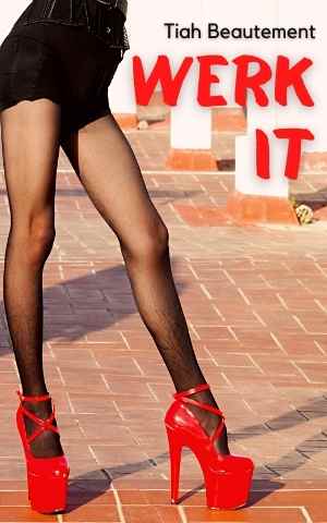
Here’s an example of how a picture got it wrong – a local example from fundza.mobi! FunDza staff create covers for stories and articles. One story was called Werk it, about a boy who liked to wear girl’s clothing. He admired a drag artist called RuPaul. For the cover, we found an image on the internet that we thought was Ru Paul, and used that as the main picture.
The writer of the story did not like the cover. She said that the person we thought was Ru Paul looked too white, and as the story was about a ‘coloured’ boy, she wanted the image to reflect that. Too often, she said, we see whites in illustrations, and she wanted young readers who relate to the character to be able to identify with the picture as well as the story. So we went back to the drawing board and created a new cover that better reflected the story that the writer wanted to tell. We agreed that it was a better picture for the story. You can see the two covers below:

How a picture is taken can also have a powerful influence on the viewer. If there is a person in a field, a photograph or film taken from high above them can make them look small and powerless. And a camera from below can make them look bigger than their environment.
Many of the images we see every day are created by advertisers. They spend billions of dollars on images and videos that make us associate their products with glamour, romance, status. For alcohol adverts we see the cold wine in the glass, the people having fun. We don’t see violent drunks, or people having accidents from drunk drivers. Advertisers study all sorts of things about images: for example, advertisers say that blue is a calming colour, and suggests reliability and honesty. Green is associated with nature, and so many products that want to emphasise how natural and healthy they are will use green.
To be visually literate means that not only do we need to be able to ‘read’ the story that the picture is telling, but also ask ourselves questions about why that picture was chosen – and sometimes, what we are not seeing, what the photographer is not showing us.
It also means that we can be more aware of the images we ourselves are presenting or creating – we need to think of what stories they are telling too.
And then of course it’s not only the images. The designer chooses the colours, the fonts (what the letters look like) carefully for maximum impact on you, the viewer. In fact, the term visual literacy also refers to the ability to be able to read graphs, tables – any information that is conveyed visually. To be visually literate you need to be read timetables and maps, but also, in some cases, asking what information has been included, what has been excluded, what story are the images wanting to tell us and why?
Because pictures and images are so much part of modern culture, the school curriculum includes ‘visual literacy’ as part of the language curriculum, to help you develop your ‘reading’ of the images you see. It is very important for young people to be able to read both text and pictures with a critical eye, especially as we are bombarded by images from advertisers, and other people, who are wanting to influence us in some way.
Look around you now at what images or pictures you can see. Who created them? What stories are they telling…?